SpaceX Website Redesign
SpaceX wants to get Earthlings excited about living on Mars. Currently, their website feels a bit dry and unimaginative even though their ultimate goal of sending human beings to Mars is far from uninspiring. I redesigned their website, making it just as fun and inspiring as the possibility of colonizing a new planet.
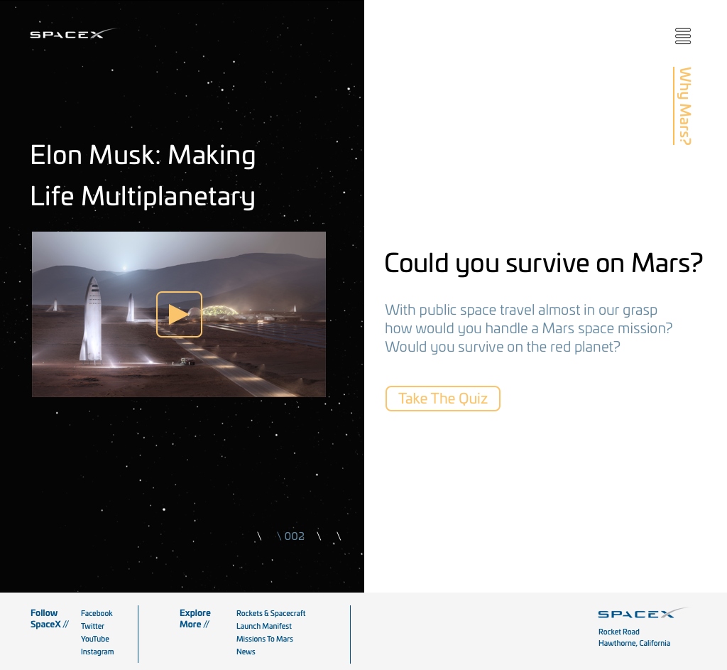
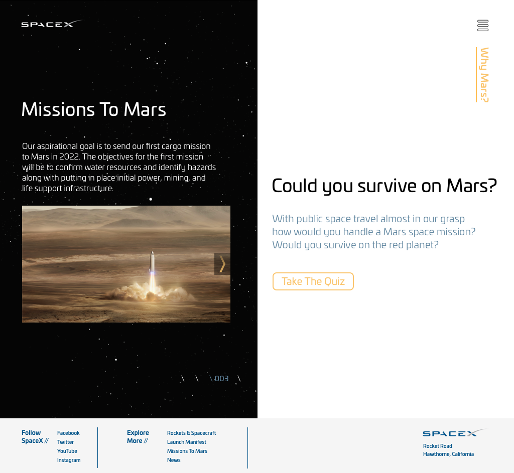
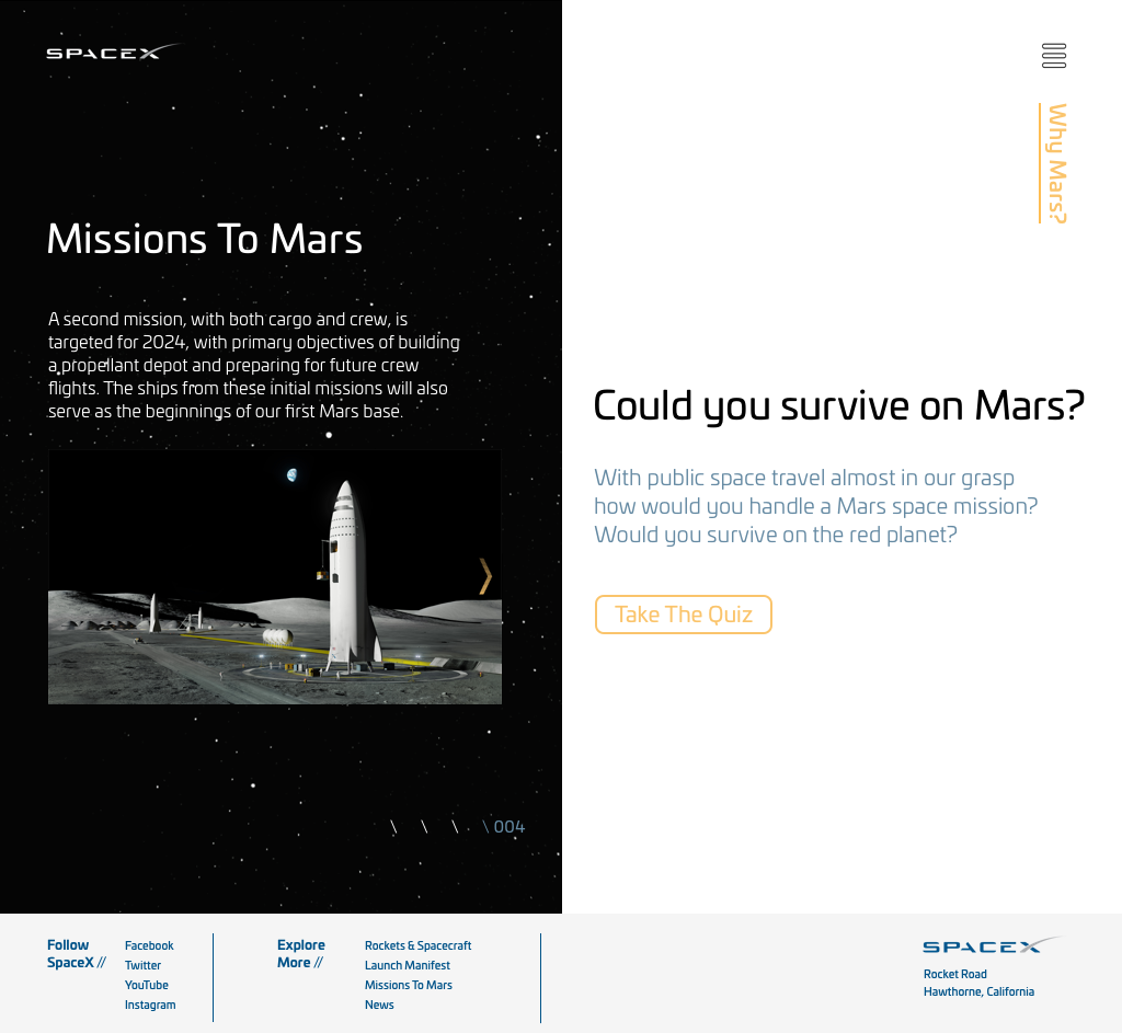
The SpaceX homepage features three screens that bump up as the user scrolls.
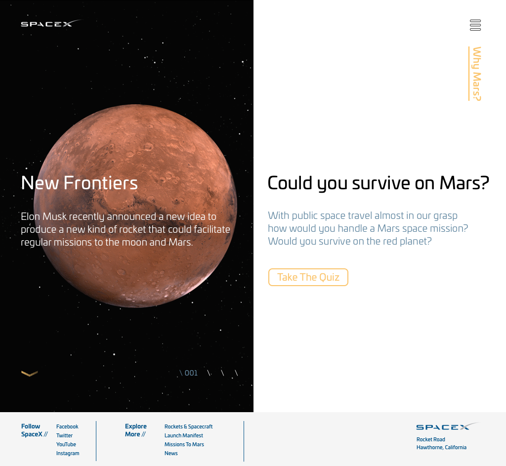
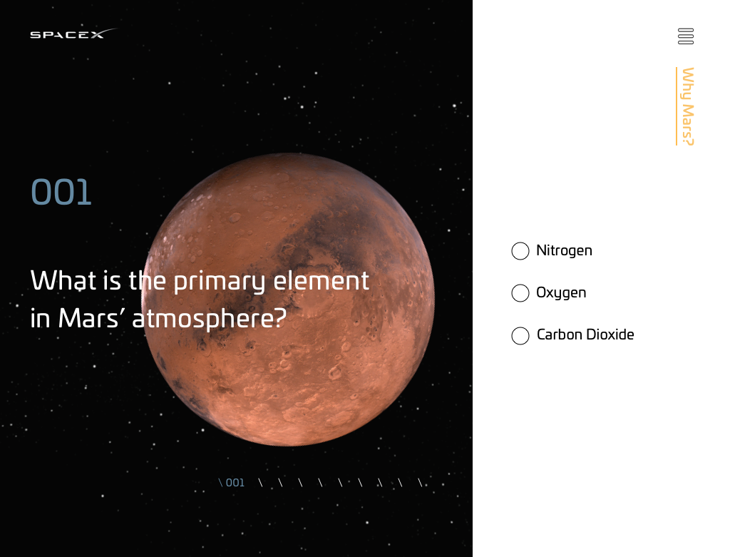
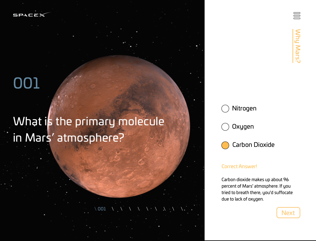
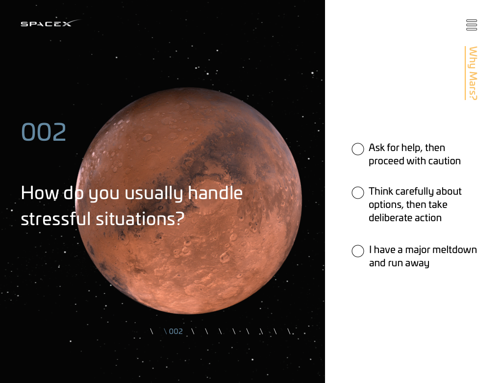
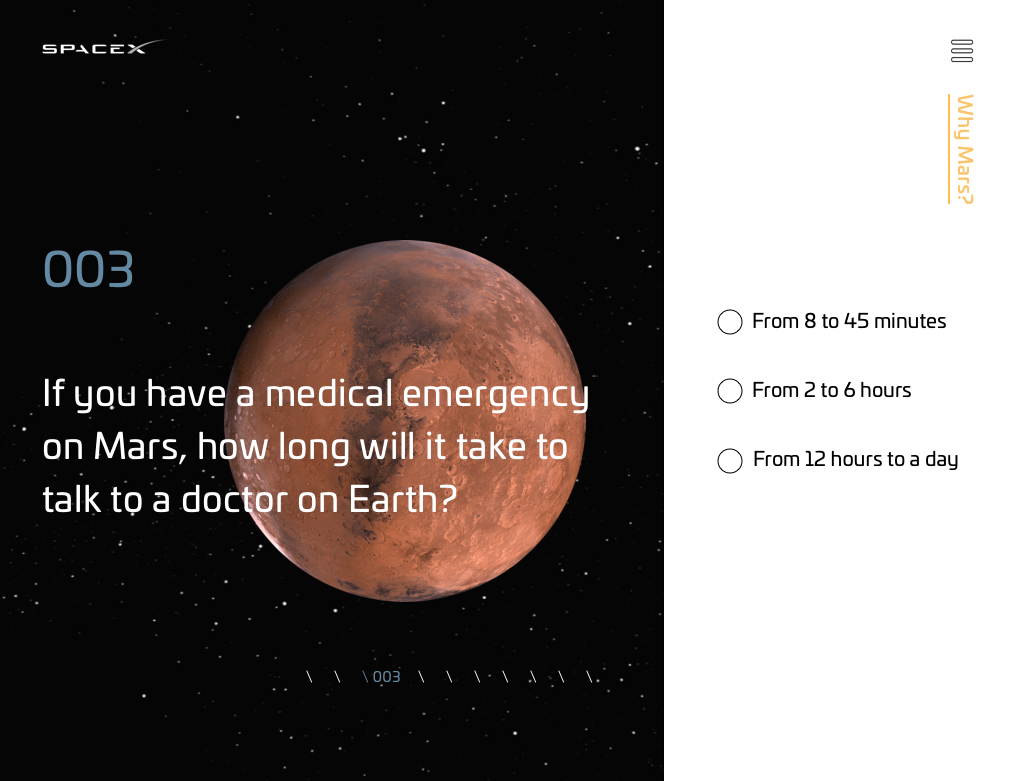
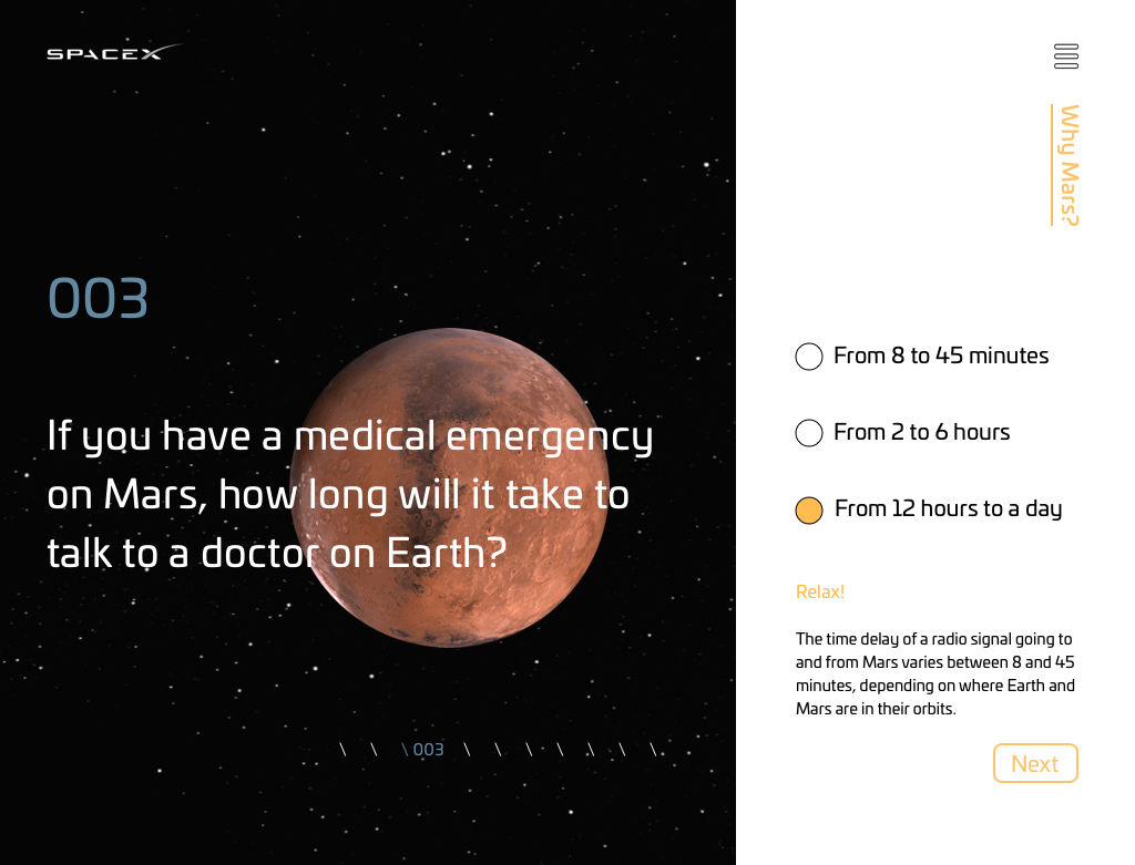
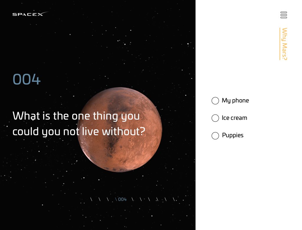
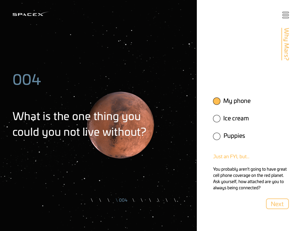
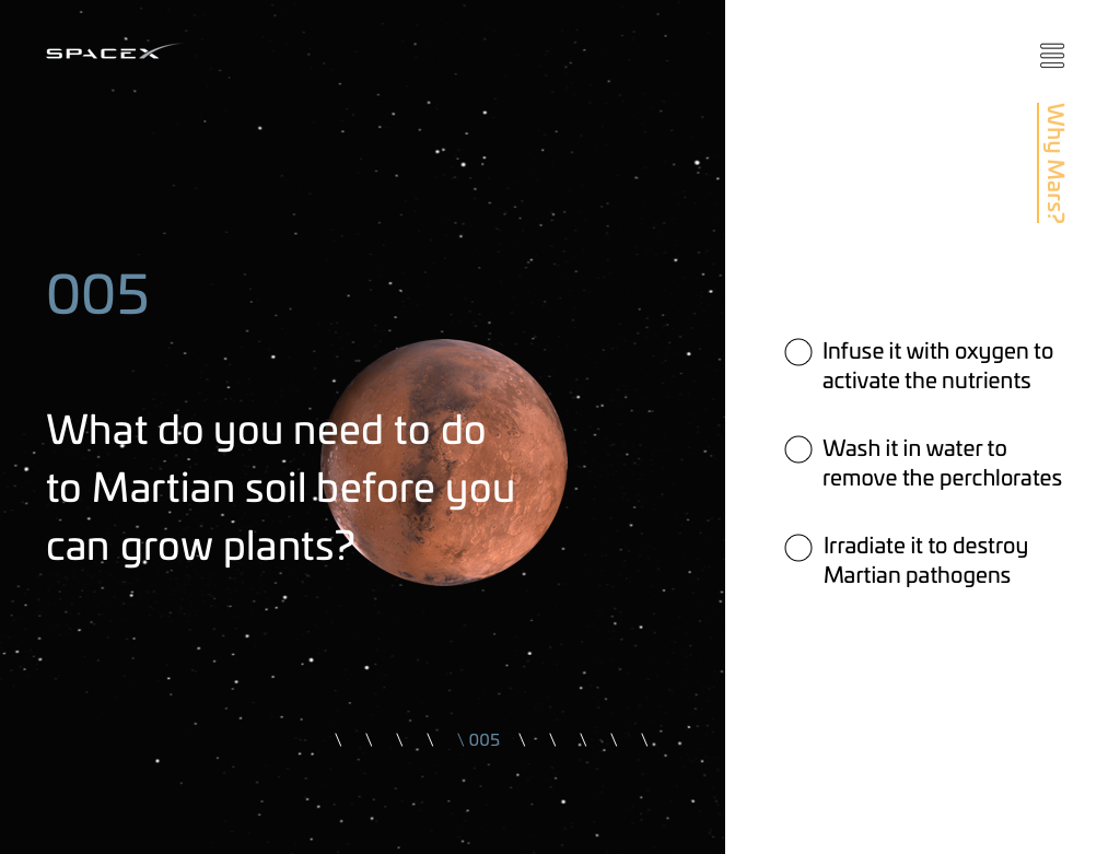
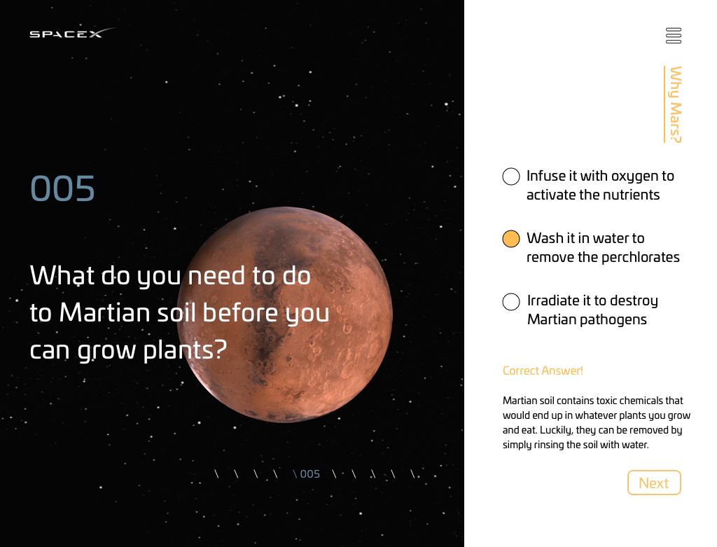
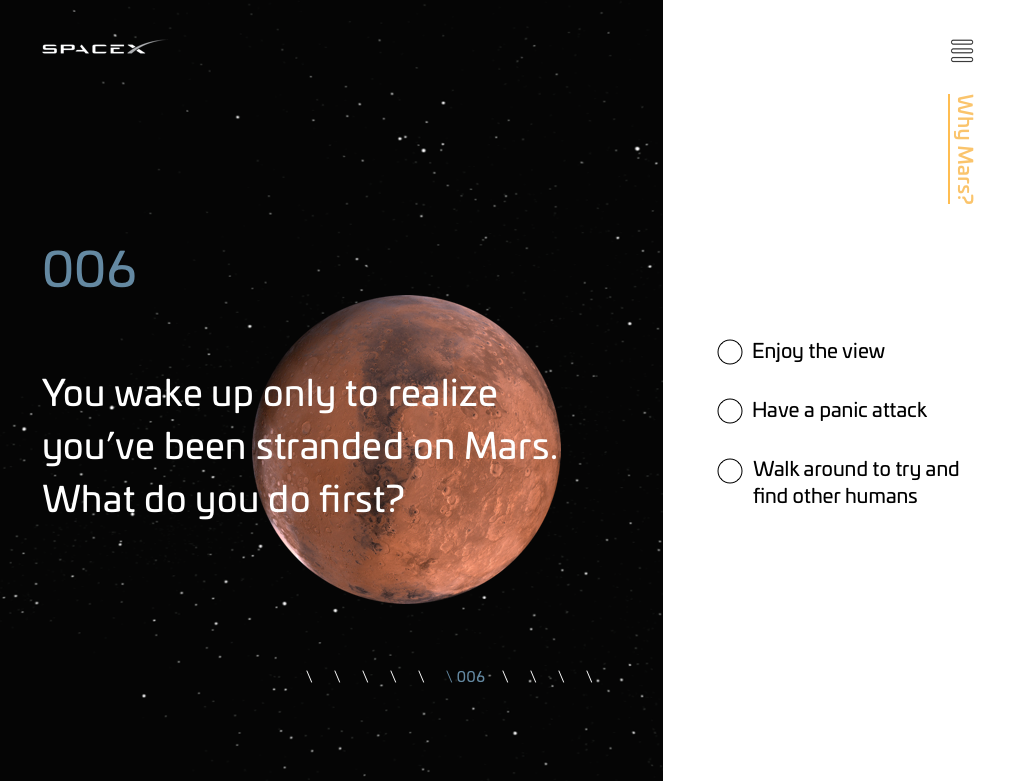
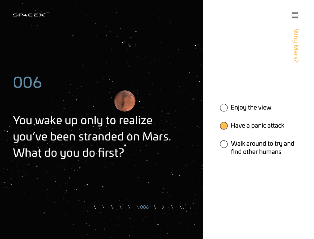
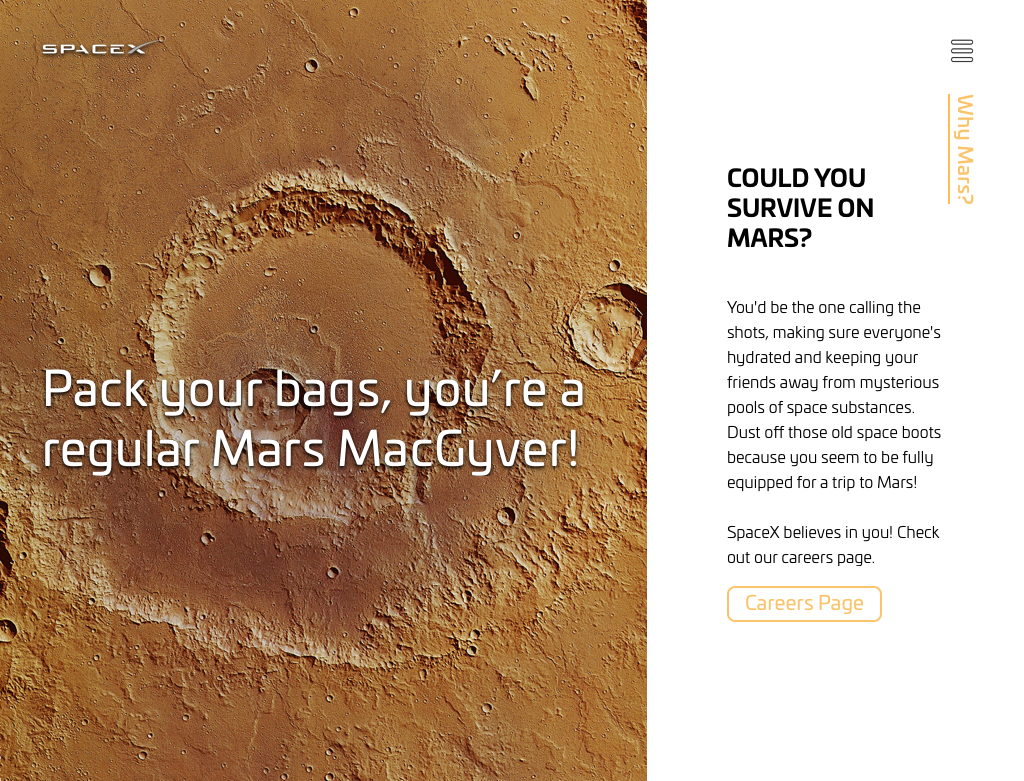
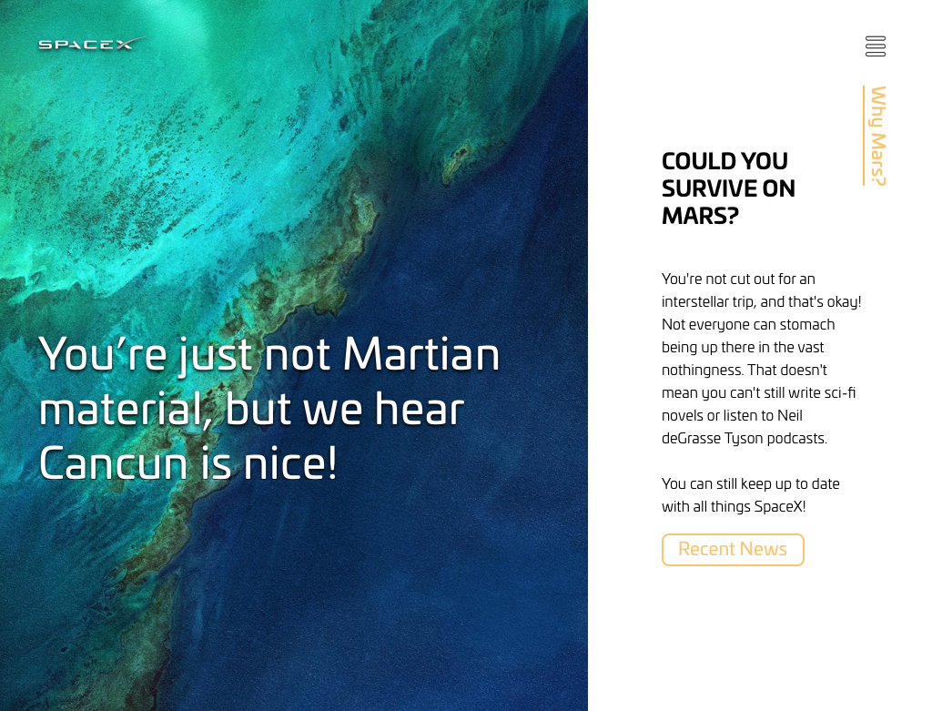
Users can scroll through content on the left side of the screen. The right side of the screen features a quiz that educates the user on what it would take to survive on Mars.
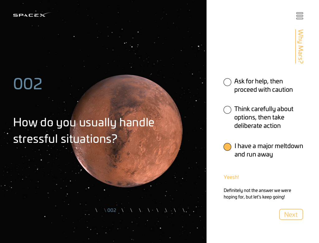
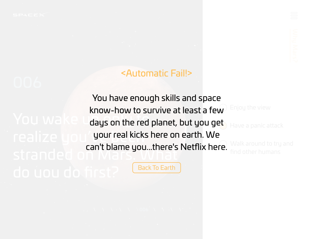
If the user answers a question favorably, they get closer to Mars. However, if the user answers a question unfavorably, the screen zooms out from Mars.
In this example, the user answers enough questions unfavorably that they receive an automatic fail.
If a user passes the quiz, they are pushed to the careers page. Otherwise, the user is pushed towards the recent news page.
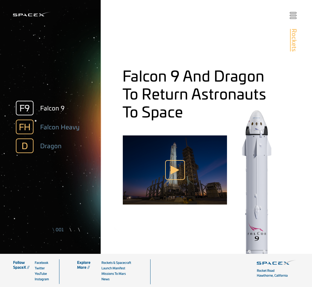
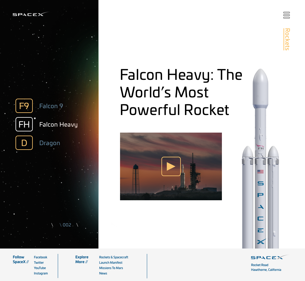
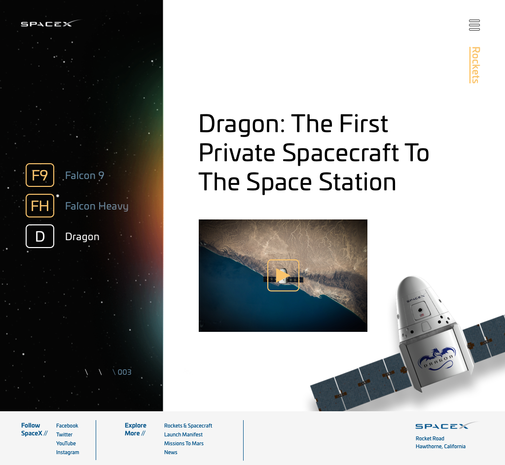
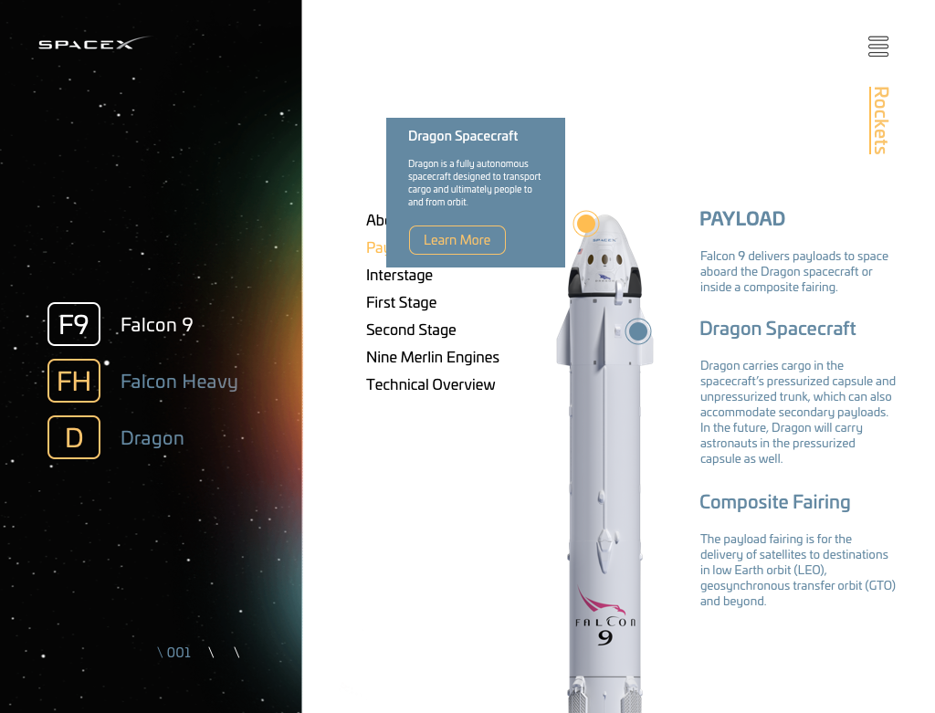
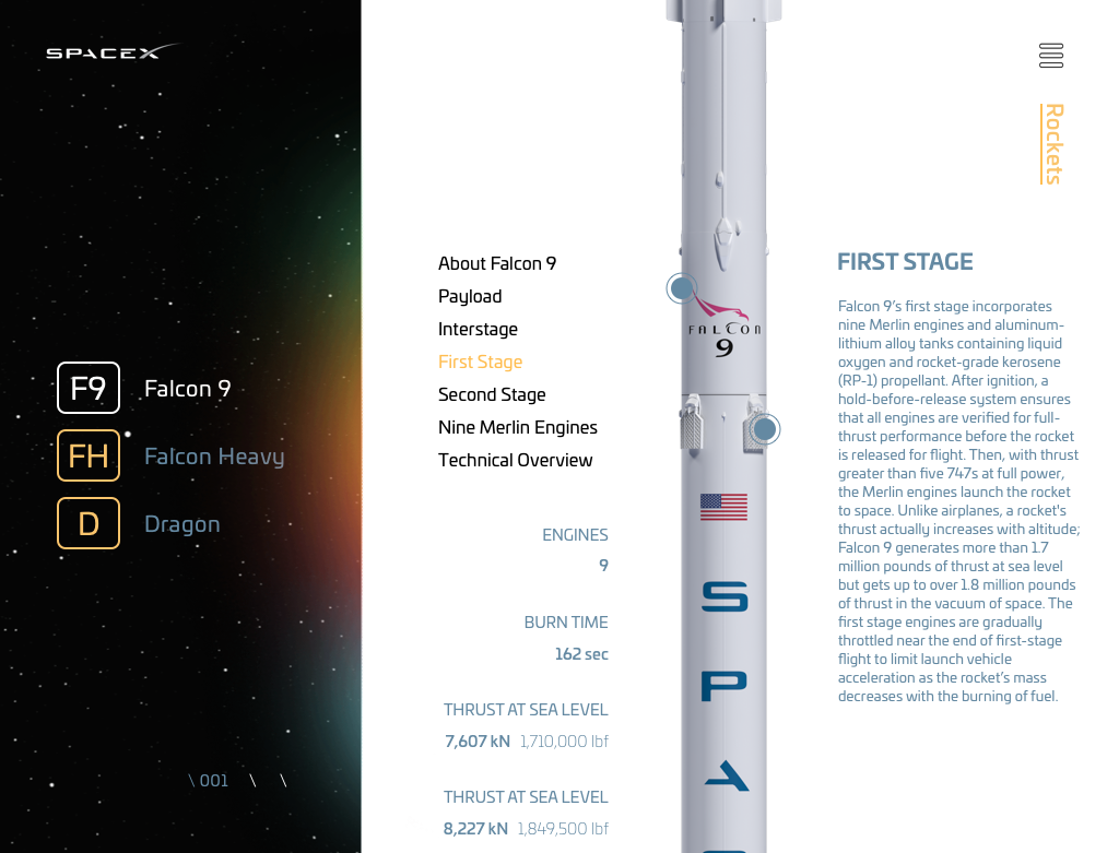
Users can view each rocket with the sub navigation on the left side of the screen.
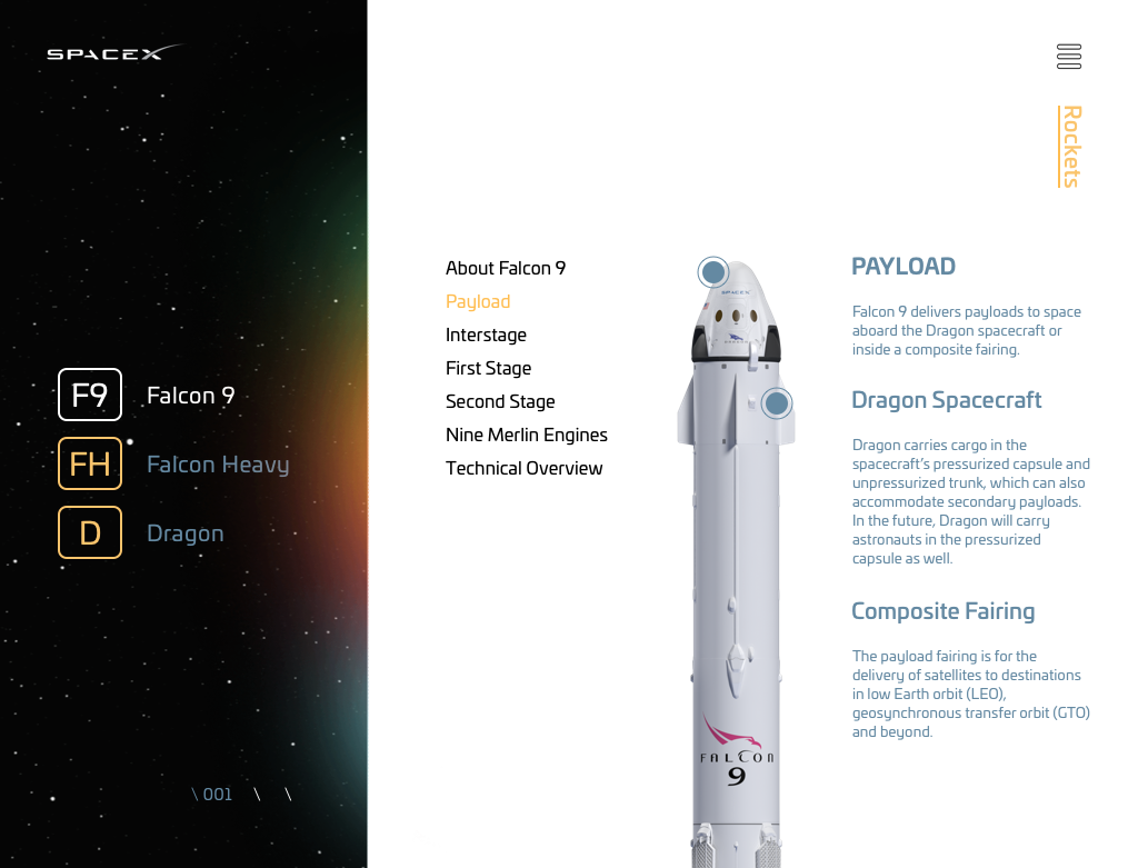
Users can interact with the rockets by hovering over different points to reveal various facts.